Table of Contents
This post will demonstrate the process of creating an onsite campaign tailored to each stage of the buyer’s journey. Whether it’s a first-time visitor or a returning customer, you will gain insights into developing popups that guide users through the sales funnel. By implementing these strategies, you can effectively increase your subscriber and customer base without causing any inconvenience to your website visitors.
Giveaway Popups
One of the most effective list-building techniques is on-site giveaways. When done correctly, giveaways help you get email subscribers who are interested in your products and want to hear about your future offers.
If you don’t want to offer discounts on every signup, giveaway popups should be your go-to email capture tool.
For your giveaway to be effective and to avoid attracting freebie-seekers, offer a relevant prize such as store credit or one of your top products.
Here’s how your giveaway popup might look:
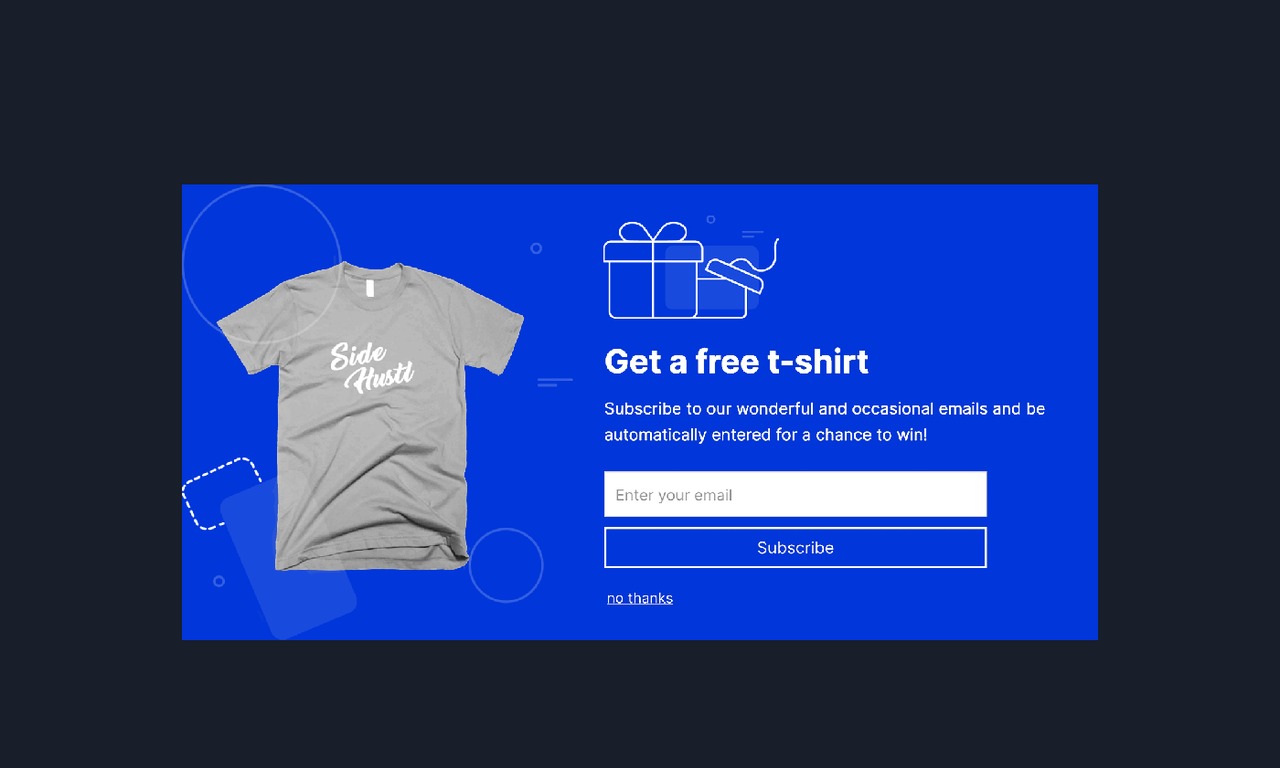
Notice a few key elements in this popup:
A benefit-driven headline focusing on your chance to win a bestseller (read: social proof);
A product image to make the prize more appealing;
Clear instructions on how to join the giveaway; and
One input field that increases your chances of signing up.
While the points above make the perfect recipe for creating a high-performing giveaway popup, the star of this popup is the countdown timer.
By using a countdown timer in your giveaway popups, you not only state when the competition ends, but you also drive urgency. This way, your visitors know that they need to sign up before the time runs out, or else they’ll miss out on a chance to win this amazing prize.
Lead Magnet Popups
Numerous e-commerce brands avoid content marketing, believing it to be either time-consuming or irrelevant. Consequently, the term “lead magnet” is predominantly linked to SaaS companies and bloggers.
Nevertheless, you can create valuable lead magnets for e-commerce without necessarily launching a blog or YouTube channel. Instead, you can compile your expertise into a PDF file or, better yet, collaborate with an expert to produce a concise guide. Subsequently, utilize this complimentary and valuable resource as a lead magnet in your popups, displaying them on product pages that are relevant to the content.
Take a look at this illustrative example:
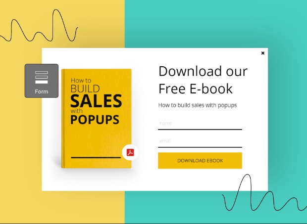
If I had a health and beauty store, I could, for example, create a free eBook on skincare (or work with an expert on it) and show this lead magnet popup only on relevant product pages. In this case, it could be organic or nature-based skincare product categories.
For apparel brands, a lead magnet can be a short guide on “how to find the perfect pair of jeans,” while for food and kitchenware stores, a “recipes for busy weekdays” PDF would work like a charm.
As long as you’re offering something valuable and relevant to your visitors, they’ll be willing to give their email addresses in exchange for it, and you’ll grow your email list with quality leads.
Discount Popups
Discounting is a dangerous game. Offer it too often and your visitors will expect it all the time. But don’t use an incentive at all, and your signups will likely take a hit.
While many e-tailers choose to give an immediate discount code upon signup, that’s not your only option.
If you don’t want to discount your products or can’t afford to offer vouchers that’ll hurt your profit margins, you can collect emails with the promise of something more exclusive.
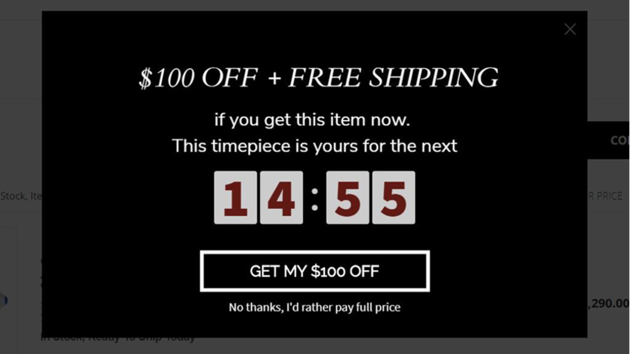
Say you’re planning to run a spring sale in a month or so. By using this upcoming sale as your anchor point, you can persuade your visitors with a VIP code that gives them an additional discount or early access to the sale.
This is what your discount popup could look like:
Sales Announcement Popups
Regardless of whether you adopt the VIP discount strategy discussed earlier, it is crucial for your sales announcement popups to consistently emphasize exclusivity when targeting existing subscribers.
By crafting compelling popup copies and offering subscriber-only discount codes, you can encourage your loyal subscribers to make purchases from your store even before the official start of your sales. Here’s an example to illustrate this approach:
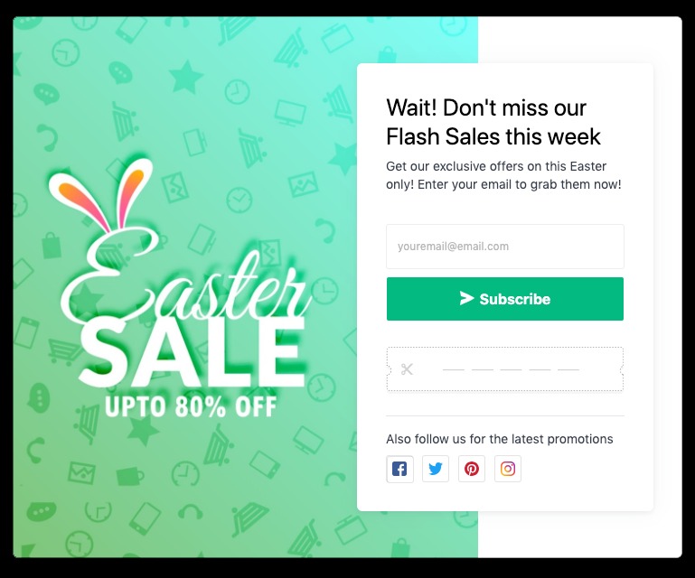
By giving early access to your subscribers, you not only appreciate and engage your email list, but also help them more easily complete their first purchase. This way, they can shop at a lower price without the risk of their favorites selling out. (And you manage to convert them into first-time buyers.)
If you’re already running subscriber-only email campaigns, make sure to support them with sales promotion popups and recreate that exclusivity in your copy.
Lastly, remember to set your popup to show only to existing subscribers, and you’re good to go.
Contact Popups
Popups aren’t only for collecting emails or pushing discount codes to your visitors.
When used right, popups can help solve your visitors’ problems and remove obstacles to buying. With a well-timed contact popup, you can offer help when needed and guide your visitors to better buying decisions.
The problem with most contact popups, though, is they make promises stores can’t fulfill. If your popup invites visitors to reach out for help anytime (although your customer service team is done for the day), they’ll likely turn to a competitor that can offer better assistance.
By creating two contact popups, one to show during office hours and another for nights and weekends, you can easily solve this problem.
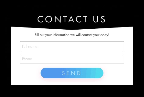
Since expert help is often needed for complex or high-end products, such as workout equipment, custom-made furniture, or software, you can create a simple popup like the one below and show them on relevant product pages:
Exit Intent Popups
More than 70% of your website visitors leave without even providing any contact information or conversion. Exit Intent helps convert such visitors who are about to leave your store. With specific and personalized targeting, you can persuade a customer leaving the site to come back and make their purchase.
Coming to the specific technology, Exit Intent helps track mouse and scroll movement on a website. Whenever we detect that a user is about to bounce, the exit intent offer is shown to the visitor to bring them back. Now, this works on mobile devices as well. While on mobile devices there is no mouse or cursor, the Exit Intent popup is triggered when the user is trying to scroll too fast to go back or presses the back button on the device.
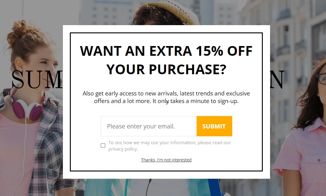
The Exit intent popup has to show a higher value proposition to the visitor, more than your welcome offer or any other sale running on your store. Remember, this is the last chance of getting the prospect to convert. Exit intent popups not only help in generating email leads, but they also help in reducing cart abandonment.
Cart Abandonment Popups
You got a visitor’s email, given an incentive, and offered your help. Yet, the visitor is about to leave their cart without making a purchase. With cart abandonment rates hovering around 70 percent, you’re not the only one that experiences this.
When prospects are this close to making their first purchase, you can’t afford to let them go. And that’s when cart abandonment popups come into play.
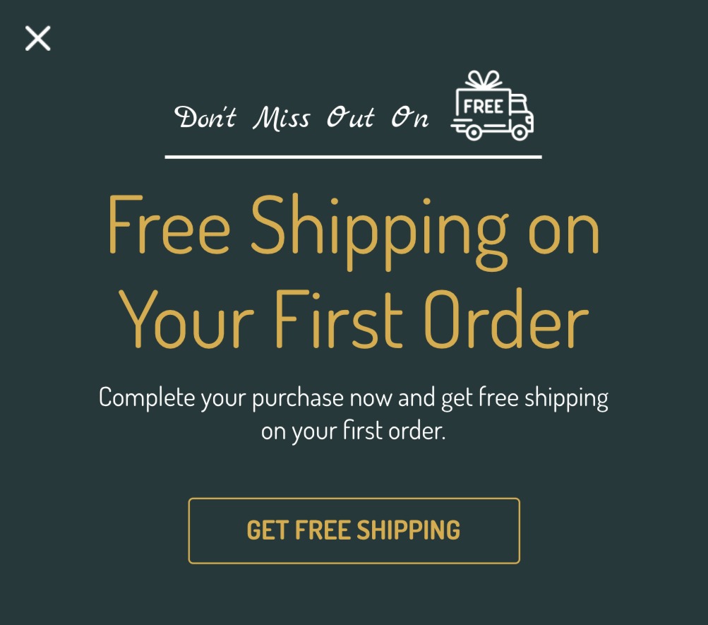
For your cart abandonment popups to be persuasive, you need to pick a compelling incentive. If your message is simply “Don’t go, finish your order!” You may not sound convincing.
Since you already have the subscriber’s email address, your popup should focus on the incentive, be it a discount code, free shipping, or a giveaway entry to win their cart items.
Here’s an example of that:
New Arrival Popups
There are a million different ways to use product recommendations for your store. You can use them in your emails to invite subscribers back to your site, and in your popups to increase sales.
While bestsellers are typically ideal for helping new visitors get started (thanks to social proof), your returning customers need something else.
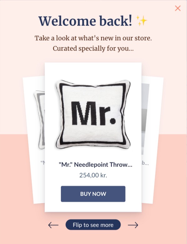
When those visitors are back in your store, they’d like to see what’s new since their last visit. And, more importantly, they’d like to be treated differently.
Welcome and wow your returning visitors with a new arrival popup that highlights exclusivity, just like this:
Upsell Popups
Upselling can be a delicate endeavor. If done incorrectly, it can result in losing customers permanently. However, when upselling is targeted towards the right individuals at the right time, it can significantly increase your revenue per order.
Returning customers are ideal candidates for upselling since they are already familiar with your store and have made previous purchases. This is an opportunity to employ a slightly more sales-oriented approach and encourage them to spend more.
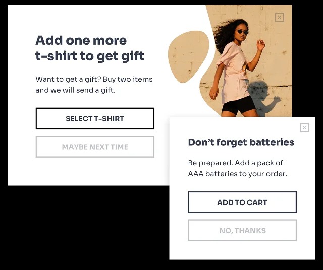
The optimal moment to introduce an upsell is, unsurprisingly, right after the customer adds a product to their cart. However, the key is to provide highly relevant recommendations based on the items already in their basket.
For example, if a customer has added kitchenware items to their cart with a total value exceeding, let’s say, $75, you can suggest more affordable products from the same kitchenware category.
Survey Popups
It’s a common challenge among e-commerce marketers. You want to get more customer feedback, but don’t want to shift customers’ focus away from your products.
The best time to survey your customers is, in fact, when they just made a purchase. Not only because it’s the moment when they’re most excited about their new buy, but also because they’ll be more likely to answer your questions at this moment.
According to Cialdini’s liking principle, we tend to say yes to the requests made by people we know and like. If a customer has bought from you, not only once but twice, they probably like you enough to say yes to a small favor.
Plus, they have more information about your store than any first-time visitor, so they can give you more valuable feedback.
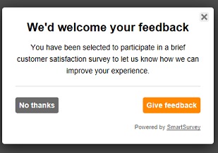
Here’s what your post-purchase survey popup might look like:
